'Antonyms'
Typhlographic book
2021
✦ First prize in the 'Wysokie Loty' competition
✦ Participation in the exhibition ‘Wnetrza i Formy’ at the International Cultural Centre in Cracow
✦ Participation in the exhibition ‘Przemysl i rekodzielo’ at the Academic Design Centre in Lodz
The main idea of the project is to integrate visually impaired children with sighted peers. The book is intended to explain to the youngest children concepts that are difficult for them to understand, such as near - far, transparent - opaque, visible - hidden. The material used, contrasts and clear shapes make it easier to learn the antonyms. The playfulness is provided by movable elements. The simplicity of the shapes streamlines the production process. The uncomplicated text is easy to translate into foreign languages.
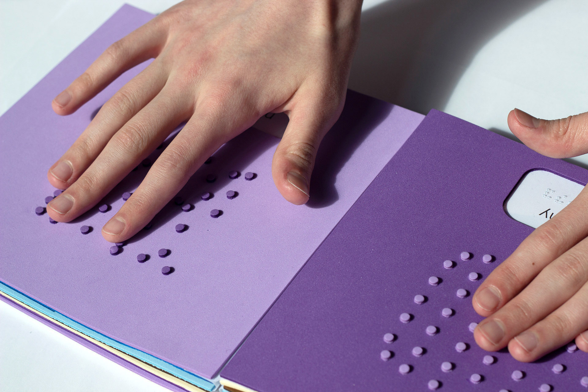
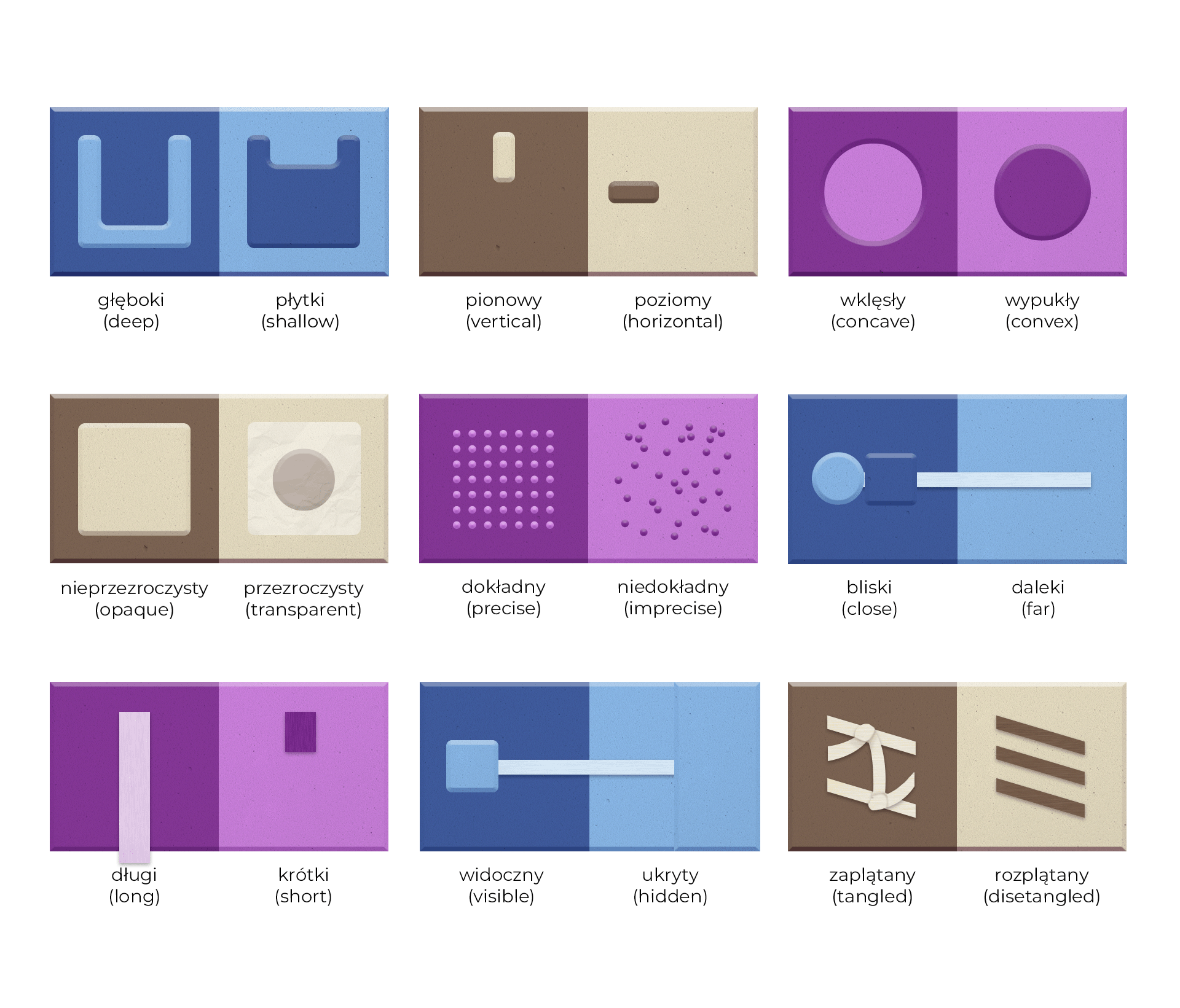


With the instructions and templates provided online, the book can be made independently by facility staff and volunteers from readily available materials.

Co-authored by: Maja Drozdz, Natalia Gemel
Faculty of Industrial Design
Academy of Fine Arts in Krakow
Supervisor: dr Lech Kolasiński
Wideo: Fryderyk Zyska MA
Software used: Adobe Illustrator, Adobe Photoshop